
When a brand wants to “look Indonesian”, the first visual solutions are often predictable.
Add a batik pattern. Use traditional ornament. Introduce a warm brown-and-gold palette. Add a familiar cultural symbol and call the result heritage-inspired.
When too many brands use the same shortcuts, cultural identity becomes cliché.
A stronger process begins by replacing the question “Which motif can we use?” with “Which design principles shape this tradition?”
Heritage is not an asset library
UNESCO describes Indonesian Batik through technique, symbolism, social function, colour, patterns and intergenerational knowledge.[1] Indonesia’s intellectual-property authority describes Traditional Cultural Expressions as cultural expressions maintained communally across generations.[2]
Together, these perspectives suggest a different design workflow.
Culture should be studied before it is sampled.
Context comes before form
Before drawing, the creative team should understand what it is looking at.
Is the element primarily decorative?
Does it hold a specific social meaning?
Is it associated with one region?
Is it used in ritual or status contexts?
Is it a communal tradition or a contemporary individual work?
Those answers shape what kind of transformation is appropriate.
Motif and technique are not the same thing
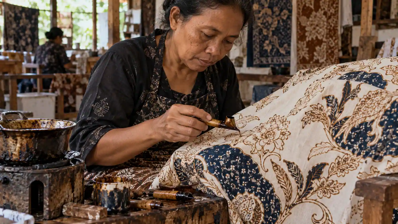
Batik provides a useful example.
Indonesia’s technical definition connects batik with hot-wax resist methods applied using hand or stamp tools.[3] A digitally printed pattern may resemble batik visually without sharing the same production process.
Design teams should therefore separate at least four layers:
technique, motif, meaning and application.
They interact, but they are not interchangeable.
Look for visual grammar, not cultural souvenirs
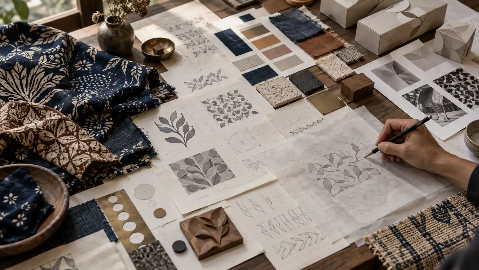
Once context is understood, designers can analyse how the visual system works.
Not only the motif itself, but repetition rhythm, pattern density, negative space, hierarchy, scale, direction, layering, colour relationships and the irregularities created by hand process.
This is visual grammar.
Grammar can often be translated without quoting the original shape literally.
Principles are more flexible than patterns
Suppose research shows that a source tradition relies on dense repetition, small secondary elements and a focal form appearing at controlled intervals.
Those principles might become an editorial grid, packaging rhythm, motion timing, retail display or interface structure.
None needs to reproduce the motif.
The translated identity comes from cadence rather than copying.
That is where cultural inspiration becomes design thinking.
Material belongs inside the system
Modern design systems often begin with digital tokens: colour, typography, spacing and components.
Heritage-led systems benefit from studying materials earlier.
Cotton, silk, fibre, wax, dye, wood or metal each behave differently.
Edges, surface variation, light reflection and hand-made irregularity can inform photography, printing, packaging substrates, texture and motion.
Do not fake imperfection
Many contemporary brands try to look handmade by adding digital distortion and rough texture.
The effect can become cosmetic.
If irregularity in batik comes from the interaction of hand, wax and textile, a designer should understand that process first.
Authenticity does not come from applying a “craft” filter.
Read colour as a relationship
Selecting one supposedly traditional colour and turning it into a brand token is another shortcut.
The richer insight is often in the relationship between colours: how a dark field frames a lighter element, how accents are rationed, how the base cloth affects contrast.
A brand can translate those relationships without claiming to reproduce an historical palette.
The system becomes more flexible and more defensible.
Typography does not need to look “ethnic”
Cultural visual projects frequently pair heritage imagery with decorative typography designed to look traditional.
The result can quickly resemble a themed restaurant or souvenir shop.
Clean contemporary typography can create stronger tension when material, composition, photography and rhythm already carry cultural character.
Not every layer needs to shout identity.
Strong systems have hierarchy
If every touchpoint carries a dominant motif, everything competes for attention.
A design system needs hierarchy.
Pattern might be prominent inside packaging but absent from the website interface. Retail spaces can express culture through material, while editorial uses photography and spacing.
Heritage becomes a language with volume control.
Build a cultural translation matrix
One practical tool is a translation matrix.
Column one: the source element—repetition, material, wax line, motif, proportion or colour relationship.
Column two: context and meaning.
Column three: what may be transformed and what should remain intact.
Column four: potential applications across packaging, UI, photography, motion, interiors or editorial.
This gives creative decisions a rationale beyond “it looks good”.
Distinguish direct use from abstract translation
Not all cultural inspiration carries the same sensitivity.
Direct use of a recognisable traditional motif requires more due diligence than abstracting rhythm, proportion or material character.
Where a project engages specific communities or expressions, questions of consultation, attribution, agreement and benefit sharing become more relevant.
WIPO encourages dialogue, informed consent, agreed terms and fair collaboration when fashion companies engage with Indigenous Peoples’ Traditional Cultural Expressions.[4] It is not a universal law for all Indonesian design, but it offers a useful ethical benchmark.
Designers need to know when to ask
Creative directors do not need to become anthropologists.
They do need to know when internal knowledge is insufficient.
If the team cannot determine whether a symbol is sensitive, who holds relevant knowledge or how it is traditionally used, guessing is poor design practice.
Research and consultation become part of quality control.
Attribution can be designed into the experience
Attribution does not need to become an intrusive legal footnote.
It can live on product cards, hangtags, websites, provenance pages, packaging inserts, exhibition copy or campaign content.
The important point is that the system creates space for source information from the beginning.
Attribution should not be added only after the brand has absorbed the cultural value.
Intellectual-property layers need separation
In 2026, DJKI again clarified the difference between newly created individual works and communal Traditional Cultural Expressions.[5] Indonesia also uses Geographic Indications for several batik products linked strongly to particular places and processes.[6]
Design teams do not need to become IP lawyers.
But brand handoff should record which elements are source heritage, which are adaptations, which are newly created and which assets may genuinely belong to the company as registrable IP.
That documentation prevents later confusion.
A real design system survives across media
A system is only useful if it can move between media without losing coherence.
Test it on packaging, mobile screens, websites, social posts, signage, product tags, editorial layouts, motion and physical materials.
If the identity works only when a full textile pattern is placed on a surface, the underlying principle may not yet have been discovered.
Motion can translate heritage too
Cultural translation does not have to remain static.
Repetition can become timing. Layering can become reveal sequences. Wax-resist logic can inspire masking behaviour. Gradual pattern formation can inform animation.
The goal is not a literal “digital batik animation”.
It is translating the logic of formation.
AI increases the need for governance
Generative AI can produce hundreds of “ethnic”, “batik-style” or “Indonesian traditional” patterns in minutes.
That accelerates ideation while making source relationships less visible.
If an output looks culturally familiar, teams still need to ask whether it resembles a specific expression and whether the brand can explain its source.
AI does not solve the provenance problem.
It makes provenance discipline more important.
Store the reasons behind design decisions
Alongside logo rules and colour tokens, heritage-driven systems should keep cultural source notes.
These can document references, consultations, collaborators, terminology, elements intentionally avoided and boundaries around certain visuals.
The benefit becomes clear when the team grows.
New designers inherit knowledge instead of reinventing—or misinterpreting—the cultural logic.
Innovation does not mean abandoning tradition
UNESCO’s inscription decision describes Indonesian Batik as a heritage that continues to evolve without losing its traditional meaning.[7]
That is an important design insight.
Safeguarding does not require every product to look as it did generations ago.
Living heritage remains alive precisely because people continue to use, interpret and transmit it.
The challenge is ensuring transformation still carries memory.
Turn one campaign into a reusable brand asset
If cultural research is conducted for only one campaign, much of the knowledge disappears after launch.
If it is translated into design principles, material libraries, visual grammar, provenance rules and governance, that knowledge becomes reusable.
The brand gains consistency.
Designers gain a framework.
Makers and communities gain clearer visibility inside the narrative and commercial relationship.
Customers receive something more credible than generic ornament.
Strong cultural design does not need to shout
One sign of successful translation is that every screen does not need to announce, “This is Indonesian.”
The rhythm may feel distinctive.
Materials carry character.
Colour relationships feel considered.
Provenance is available when customers want to look deeper.
Heritage stops being a sticker.
It becomes the logic through which the system thinks.
That may be a more powerful form of respect: not freezing tradition into a motif that is repeatedly copied, but understanding it deeply enough to help it enter new media without losing its connection to where it came from.
- [1] UNESCO. Indonesian Batik — Representative List of the Intangible Cultural Heritage of Humanity.
- [2] DJKI. Communal Intellectual Property.
- [3] Ministry of Industry, Balai Besar Kerajinan dan Batik. SNI 0239:2019 — Batik terminology.
- [4] WIPO. Traditional Cultural Expressions and Fashion.
- [5] DJKI. Copyright, Industrial Design, Traditional Cultural Expressions and Geographic Indications, January 12, 2026.
- [6] Ministry of Industry. National Batik Day 2026, September 18, 2026.
- [7] UNESCO. Decision 4.COM 13.44 — Indonesian Batik.
- The “cultural translation matrix” is a GATICORP editorial/design framework, not an official standard. WIPO principles are presented as an ethical benchmark rather than a universal legal obligation for all Indonesian design projects. The article does not claim that every traditional motif requires individual permission; due diligence depends on source, rights, community context and intended use.
Published: September 27, 2026